
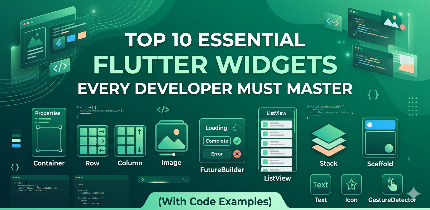
Introduction to Flutter Widgets
In the world of Flutter development, everything is a widget. From a simple piece of text to the entire app layout, widgets are the building blocks of your user interface. To build high-quality, performant, and beautiful cross-platform applications, understanding the core widgets provided by the Flutter SDK is essential. In this guide, we will explore the top 10 Flutter widgets that every developer should have in their toolkit, complete with practical code examples.
1. Container
The Container widget is the most versatile widget in Flutter. It allows you to decorate, position, and size its child widget. You can add padding, margins, borders, background colors, and even shapes.
Container(
  margin: const EdgeInsets.all(10.0),
  padding: const EdgeInsets.all(20.0),
  color: Colors.blue,
  width: 100.0,
  height: 100.0,
  child: const Text('Hello World'),
)
2. Row and Column
These are the fundamental layout widgets. Row displays its children horizontally, while Column displays them vertically. They use Flexbox-like logic to distribute space.
Column(
  mainAxisAlignment: MainAxisAlignment.center,
  children: [
    Text('Item 1'),
    Row(
      mainAxisAlignment: MainAxisAlignment.spaceEvenly,
      children: [Icon(Icons.star), Icon(Icons.star)],
    ),
  ],
)
3. ListView
When you have a list of items that exceed the screen height, ListView is your go-to widget. It provides scrolling capabilities out of the box and is highly optimized for performance using the ListView.builder constructor.
ListView.builder(
  itemCount: 20,
  itemBuilder: (context, index) {
    return ListTile(
      title: Text('Item $index'),
    );
  },
)
4. Stack
The Stack widget allows you to overlap multiple widgets. This is particularly useful for placing text over an image or creating complex custom UI elements where layers are required.
Stack(
  children: [
    Container(width: 200, height: 200, color: Colors.red),
    Positioned(
      top: 10,
      left: 10,
      child: Text('Overlay Text'),
    ),
  ],
)
5. Scaffold
The Scaffold widget provides a high-level structure for a screen. It implements the basic Material Design visual layout, including slots for an AppBar, Drawer, FloatingActionButton, and BottomNavigationBar.
Scaffold(
  appBar: AppBar(title: Text('My App')),
  body: Center(child: Text('Main Content')),
  floatingActionButton: FloatingActionButton(onPressed: () {}),
)
6. Image
Displaying images is a core requirement for most apps. The Image widget supports various sources, including assets, network URLs, and files.
Image.network(
  'https://example.com/image.png',
  fit: BoxFit.cover,
)
7. GestureDetector
Not every widget has a built-in 'onPressed' property. GestureDetector allows you to wrap any widget and detect gestures like taps, double taps, long presses, and drags.
GestureDetector(
  onTap: () => print('Widget Tapped!'),
  child: Container(color: Colors.green, padding: EdgeInsets.all(10), child: Text('Tap Me')),
)
8. FutureBuilder
Handling asynchronous data is easy with FutureBuilder. It listens to a Future and automatically rebuilds its UI based on the state of that future (loading, success, or error).
FutureBuilder(
  future: fetchData(),
  builder: (context, snapshot) {
    if (snapshot.connectionState == ConnectionState.waiting) return CircularProgressIndicator();
    if (snapshot.hasError) return Text('Error occurred');
    return Text('Data: ${snapshot.data}');
  },
)
9. AnimatedContainer
To add smooth transitions without complex animation controllers, use AnimatedContainer. When its properties change (like color or size), it automatically animates from the old value to the new one.
AnimatedContainer(
  duration: Duration(seconds: 1),
  color: isSelected ? Colors.blue : Colors.grey,
  width: isSelected ? 200 : 100,
  child: FlutterLogo(),
)
10. StreamBuilder
For real-time data updates (like a chat app or live scores), StreamBuilder is essential. It rebuilds itself every time a new event is emitted from a Stream.
StreamBuilder(
  stream: chatStream,
  builder: (context, snapshot) {
    return Text('Latest Message: ${snapshot.data}');
  },
)
Conclusion
Mastering these 10 widgets will significantly improve your efficiency as a Flutter developer. By combining these building blocks, you can create virtually any UI imaginable. Keep experimenting with their properties to discover the full potential of the Flutter framework.
Join the Conversation
0 Comments
Log in to join the discussion
No comments yet
Be the first to share your thoughts!